Review of The Rescuers at the ArtWalk, Port Macquarie
On Thursday 21st April, 2016, the projected version of The Rescuers went on display for one night for the ArtWalk in Port Macquarie. The night was considered by all involved to be a huge success, with the Place Making team of Port Macquarie-Hastings Council, who organised the event, estimating that 2800 people out on the streets of the town's CBD for the event.
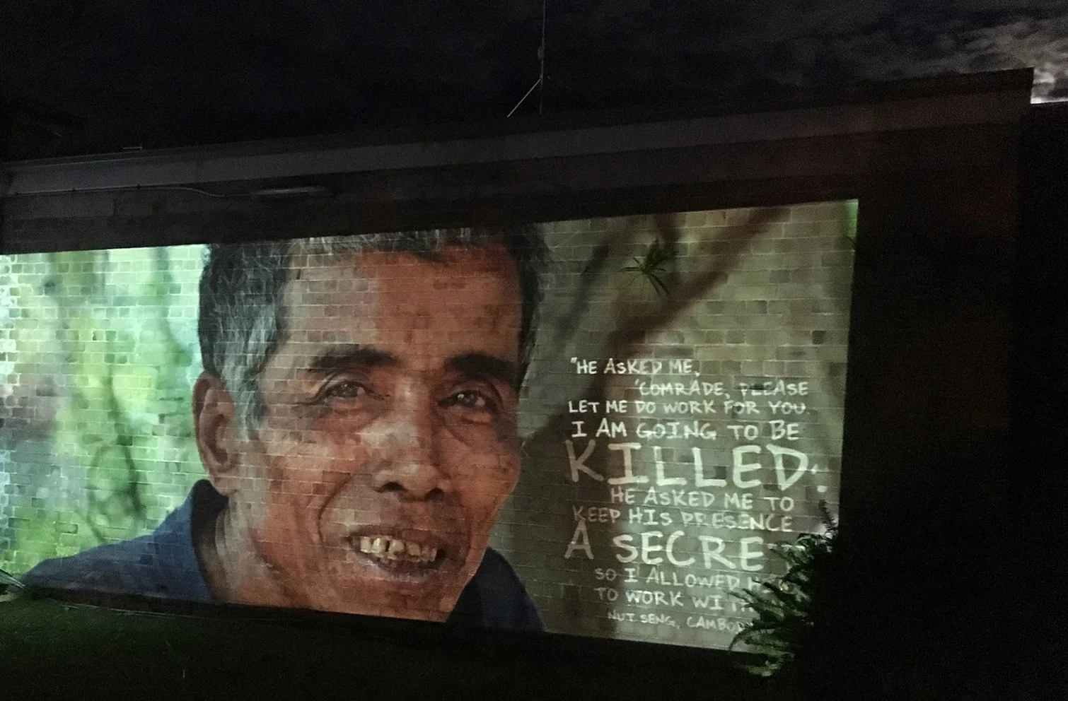
The Rescuers was projected onto the side of the police station's older building. As the sun went down, a full moon came up, making the atmosphere of the night just a little more magical. The texture of the brick wall (and the addition of a fern in the top right hand corner) also really added to the whole effect of the exhibition.
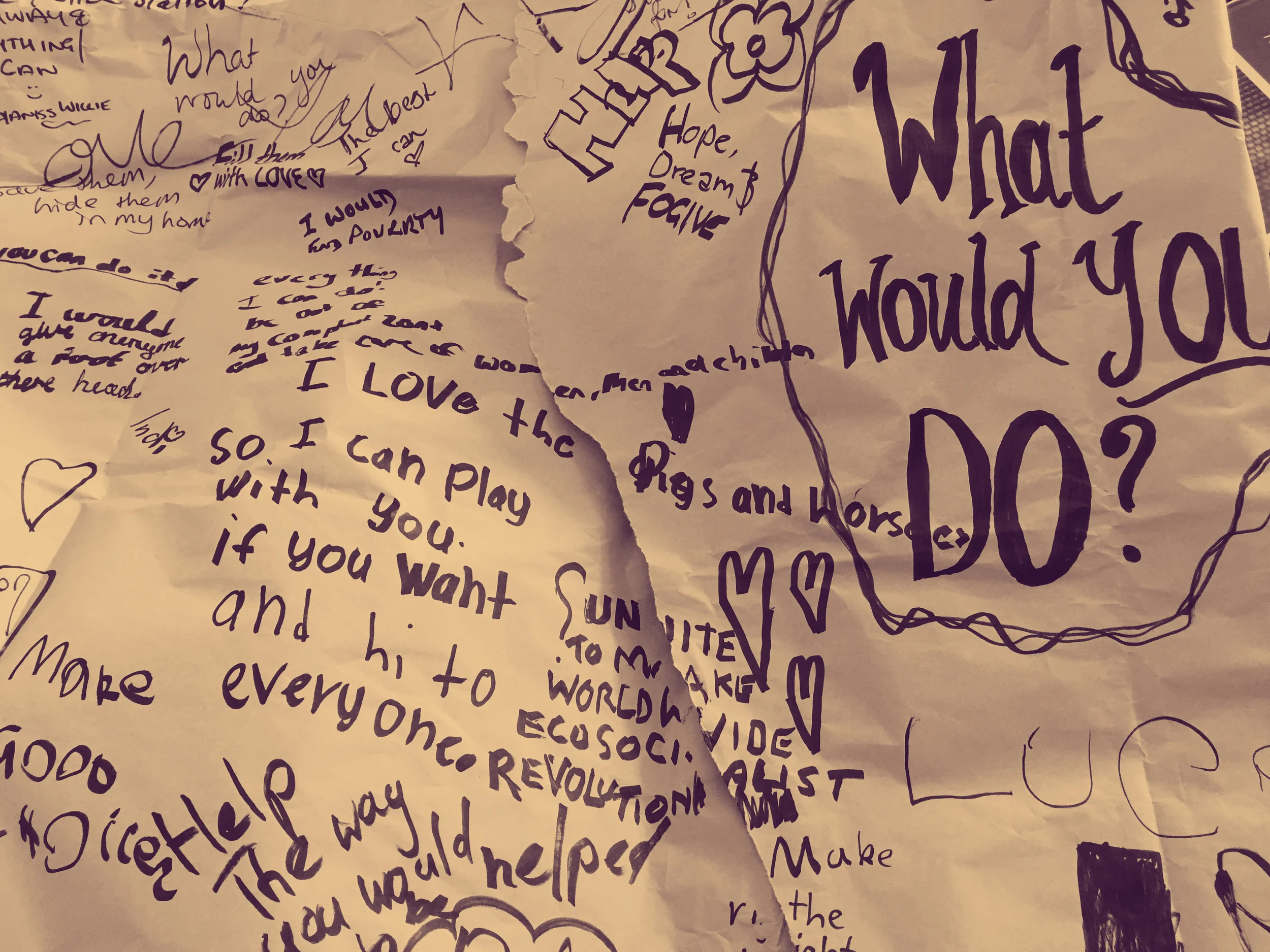
On the night, I also wrapped craft paper around the large gum tree that is close to the wall, and wrote the question from the exhibition, "What would you do?" onto it. A wide range of people wrote responses on the paper, from small children to the elderly. Below are some of the responses people wrote to the question after seeing the exhibition.
Before I go on and discuss the processes of the design and what it turned up, I just wanted to share with you some photos of the exhibition on the night, while it was projected on the wall. The bricks (and the fern in the top right hand corner!) lent such a beautiful texture to the design, and these combined with the sheer scale of it (and the addition of the music), worked together to create a really powerful display. It was also a rare occasion for me to be on site when audiences are viewing an exhibition, and because I was anonymous to most of them, it allowed me the golden opportunity of hearing and observing their reactions to it. Some people began to ask questions about it, and on those occasions I stuck up my hand as being the designer and spoke to them about the project, who PROOF is, my research and the Rescuers. What struck me the most was how many people said how moved by it they were. I think that this also really came through in the comments they left on the paper around the tree.




Processes
The process of designing took several phases: the first was the design brief (outlined in the previous post). The second was an exploratory process in which an analysis of testimony based on the Critical Hermeneutic framework. Of particular interest was Roberg's (2011) outline of Paul Ricoeur's Theory of Meaning, Theory of Action and Theory of Experience in order to understand ideology. In practice, what this meant was trying to understand the ideological positions of the rescuers through an examination of identifiable oppositional ideologies found within their testimonies. These were colour coded, as in the examples below:
The creation of the design brief and the initial analysis of testimonies above proved to be useful as a way of creating what Jahnke (2012) called "critical distancing" (p. 34). Through the creation of the brief, and subsequent analysis of the information gathered, I could look at well-worn information with new eyes, not only about the exhibition stakeholders, but also about the rescuers themselves. The testimonies revealed new insights into the people that told their stories: this is important because, as I've design this exhibition a number of times, I ran the risk of 'designing on auto pilot'. Instead, by undertaking this initial analysis, some surprising information was revealed. For example, people often repeated key words, and other words that were associated with it, such as 'house', 'home', 'lived', or spoke of a part in their house that they would hide people. Others spoke of the history of their home, and the generations of their family that had lived in a very close proximity to them. This revealed that their ideological position was based on the home being a sanctuary, not only for themselves, but for their neighbours. Temporal references also revealed ideological positions, such as those that spoke about their attitude towards their neighbours before the war regardless of their ethnic background, and their surprise at its outset. These might appear, at first glance, to be small points to mark, but in fact they had a major impact on the direction in which the design of their testimony went.
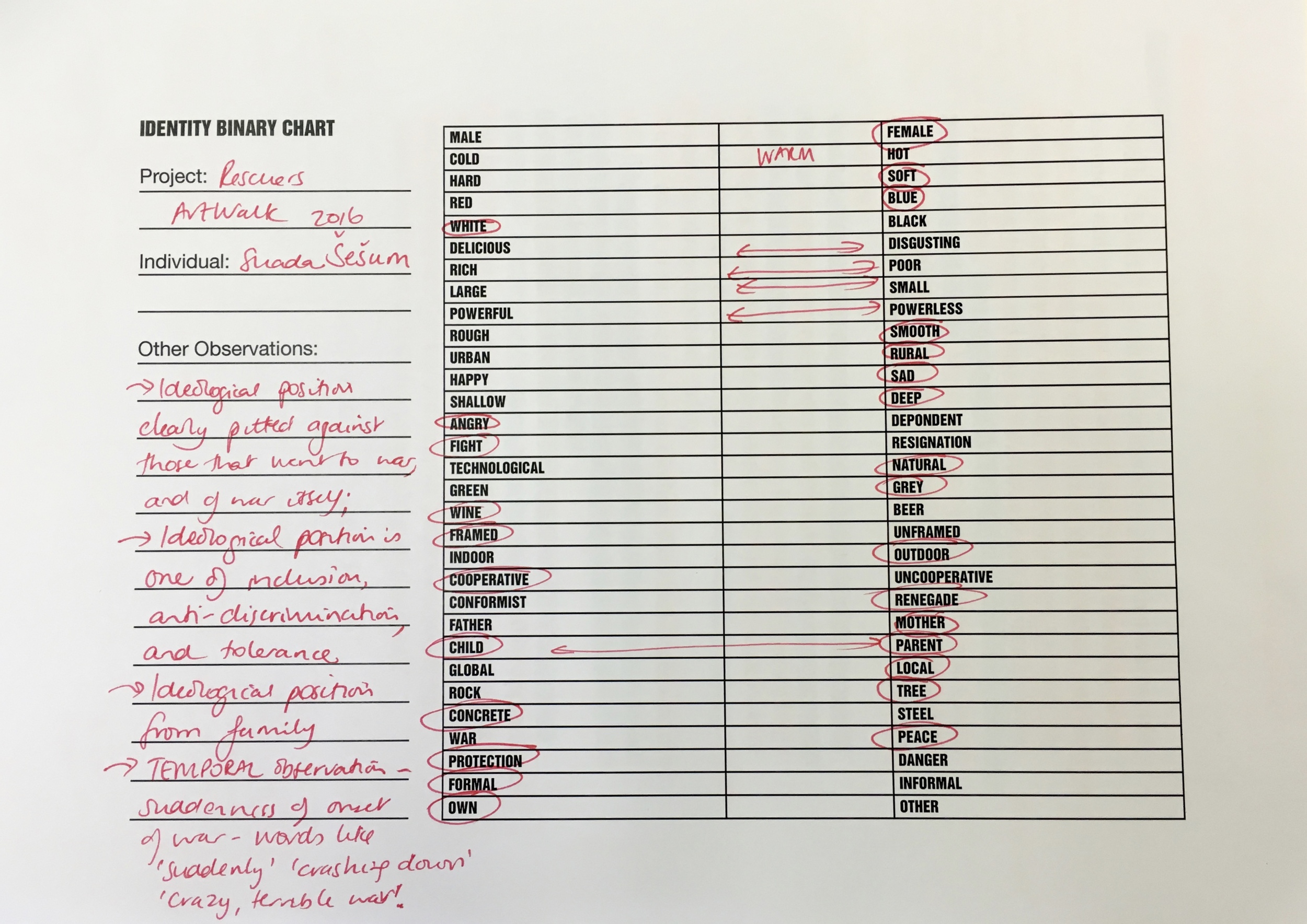
The following stage was to extend this analysis through the semiotic 'binary' sheet. I have modified this from the initial layout created in 2014, when the first two posters were designed. Along with the binary list is also an area to note key words within the testimony and another space for general notes. Examples of these can be seen below:
As a method for supporting the interpretive processes of design practice, these initial stages were extremely useful. It was fast and efficient, which is important - after all, one of the main aims of this research project is to address the practice of difficult exhibition designers that often sees them working with extensive content, complex stakeholder arrangements and tight deadlines. This doesn't make our interpretive work - and the representations that flow from this - any less important.
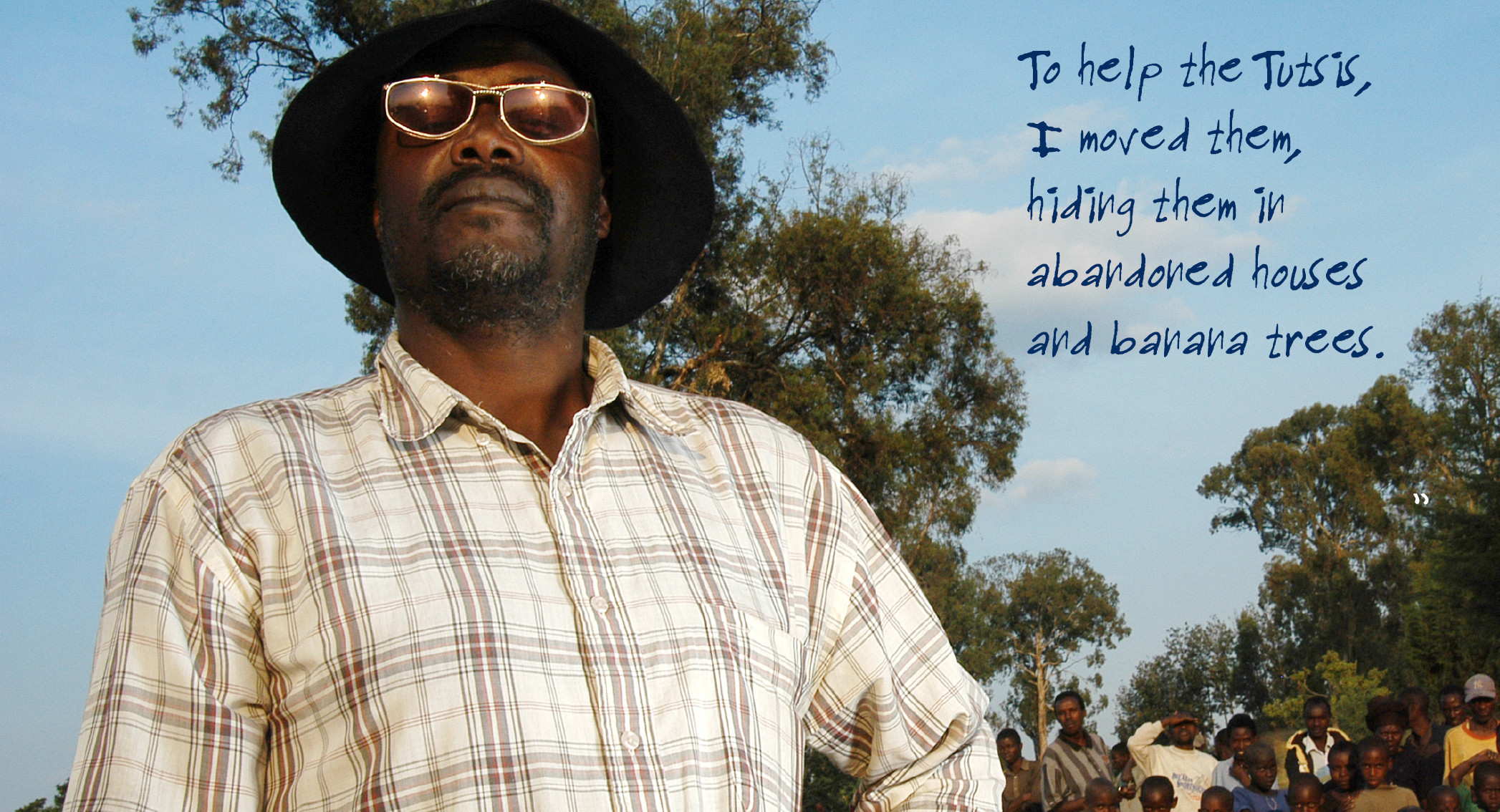
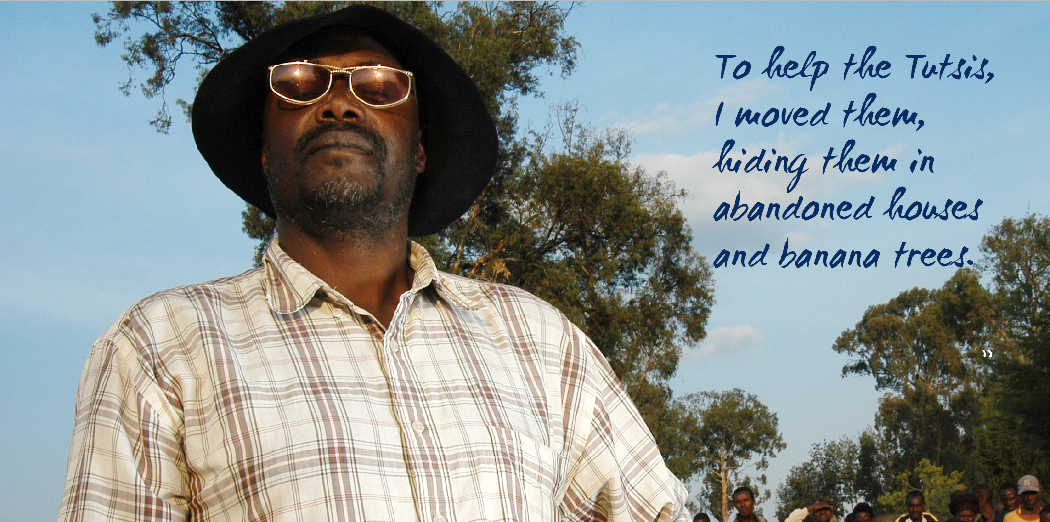
What these stages also did was reveal tacit knowledge that had been gained. The binary system in particular made me think about the rescuer, their testimony and their image (which formed part of the social semiotic, multimodal analysis, which will be explained in more detail in a later post) and try to 'name' those intangible things that help to sketch their character - not in a psychoanalytical way, but as a means of interpretation. What it does, at the same time, is also help me to 'name' or reveal those ideas within myself, formed by my own context, that might hold sway over design decisions. For example, prior to the ArtWalk, I had only worked with edited testimonies of each rescuer, but for this, was also sent the original translations of rescuer interviews in Rwanda. The photographic image of Leonard Rurangirwa always suggested a man of strength, not only because of his stance within the image, but also because of the many people who, quite literally, 'stood behind him'. In his full testimony, this stance took on an expanded meaning. Leonard is not just someone who would not only harbour people who needed a safe place to hide, but he would also perpetrate violence on those who attempted to hurt others. It was in designing Leonard's testimony that the change this analysis can have to design was most pronounced.
I wanted to somehow capture the ferociousness of Leonard's approach to rescuing, and was looking for a hand written type that was 'hurried' and had a lot of straight edges to it - no curves if possible, as these suggest a softness. I wanted Leonard's hard edge to show through. A contrast with this is the typeface I chose for Hasan Josovic (Bosnia & Herzegovina), which expressed the quietness with which he went about rescuing the man he did, and also reflected that soft curve of the street lamp and the curve of his arm.
Where to from here?
While the analysis of Leonard's testimony and image might have resulted in a directed search for a typeface to represent his story, this was not so easily done for all of the rescuers. This slowed the process down considerably, and revealed that, although the analysis has a lot of potential, what is needed now is to investigate a way to break those binary systems down further into type styles. I've investigated the possibility that there might be software out there to help with this, but at present the search has been fruitless. What I'd like is to find (or later develop as a collaborative project) an add-on to the Adobe software that allows you to search for a typeface using keywords (rather than searches on websites, for example, that will only find typefaces with your key works if it happens to be included in the name of the typeface).
As it is, I have come up with a plan to reinvestigate some of the literature that already exists on typographic design and social semiotics, and see if this will provide a path.
I'm leaving this here now, but there is a lot to go on from here, and the design of the ArtWalk exhibition has provided me with a really interesting practice case, and one I feel I can build on during the next phase: the printed posters.
Here is the final video, uploaded onto Vimeo. It still needs some editing (I was in a bit of a mad rush to finish it - it was literally down to the last second!), and I need to add a name credit for Leora at the end. I will upload the new file when it's done to this location, so it should automatically update the view when this is done.
Resources:
Jahnke, M. (2012). Revisiting Design as a Hermeneutic Practice: An Investigation of Paul Ricoer's Critical Hermeneutics. Design, 28(2), 30-40.
Roberge, J. (2011). What is critical hermeneutics? Thesis Eleven, 106(1), 5-22. doi:10.1177/0725513611411682
