Logo done and layouts begin
I worked yesterday on bringing in the map of Fergusoninto the shape of the boundary for the logo. I've sent it off for approval and we're good to go!
I did try a range of different typefaces for the logo before this, but in the end the original typeface (Rift Soft) was the best one. Here are some of those experiments (apologies for the first image, which is showing its vectors!):
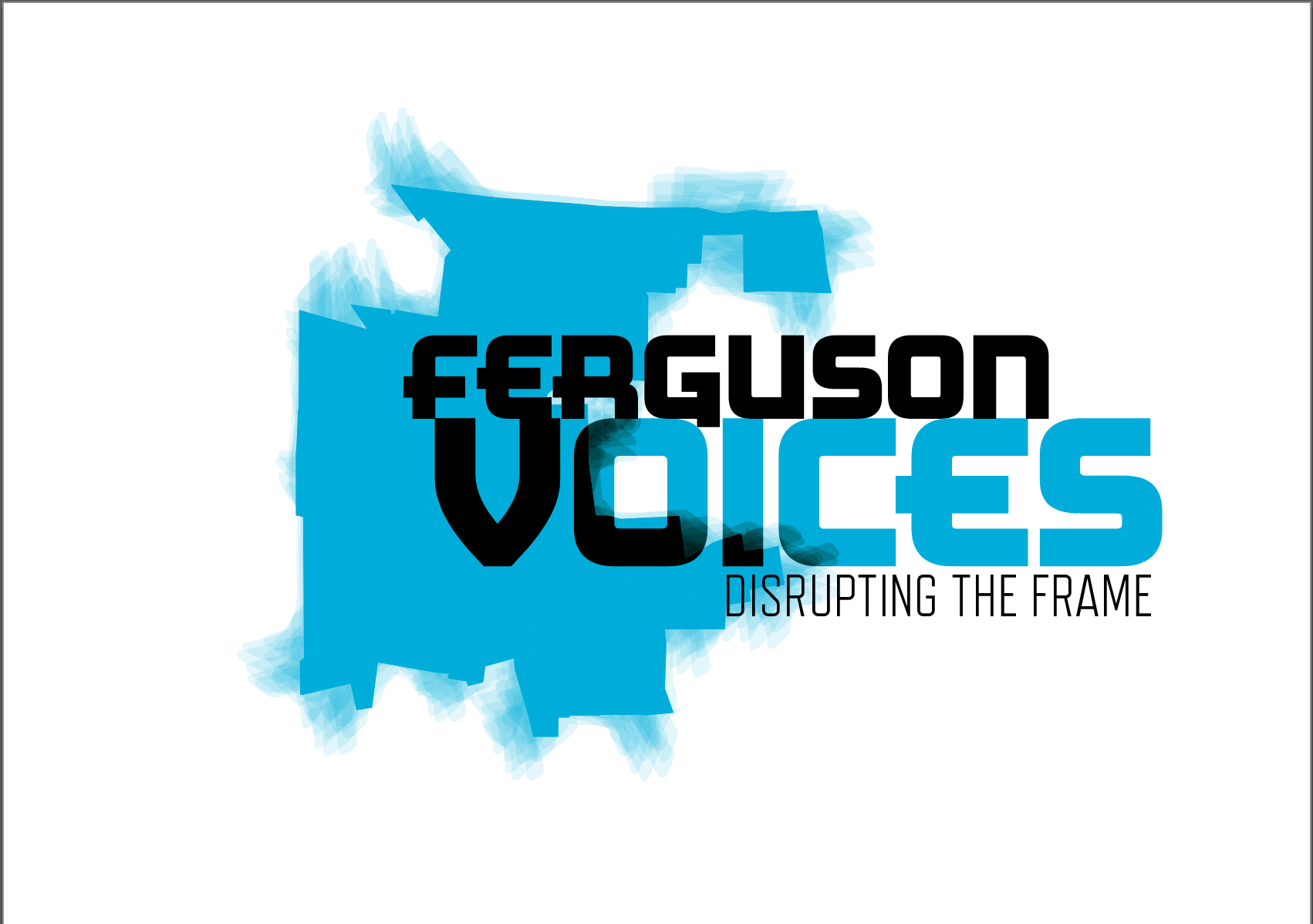
I had originally planned for the map to be quite subtle underneath the graphic of the Ferguson boundary. After using a round fan brush to erase into it in Photoshop, it came up with such a beautiful texture that I decided instead to try it on top of the shape and slightly offset it. Here is the final outcome:
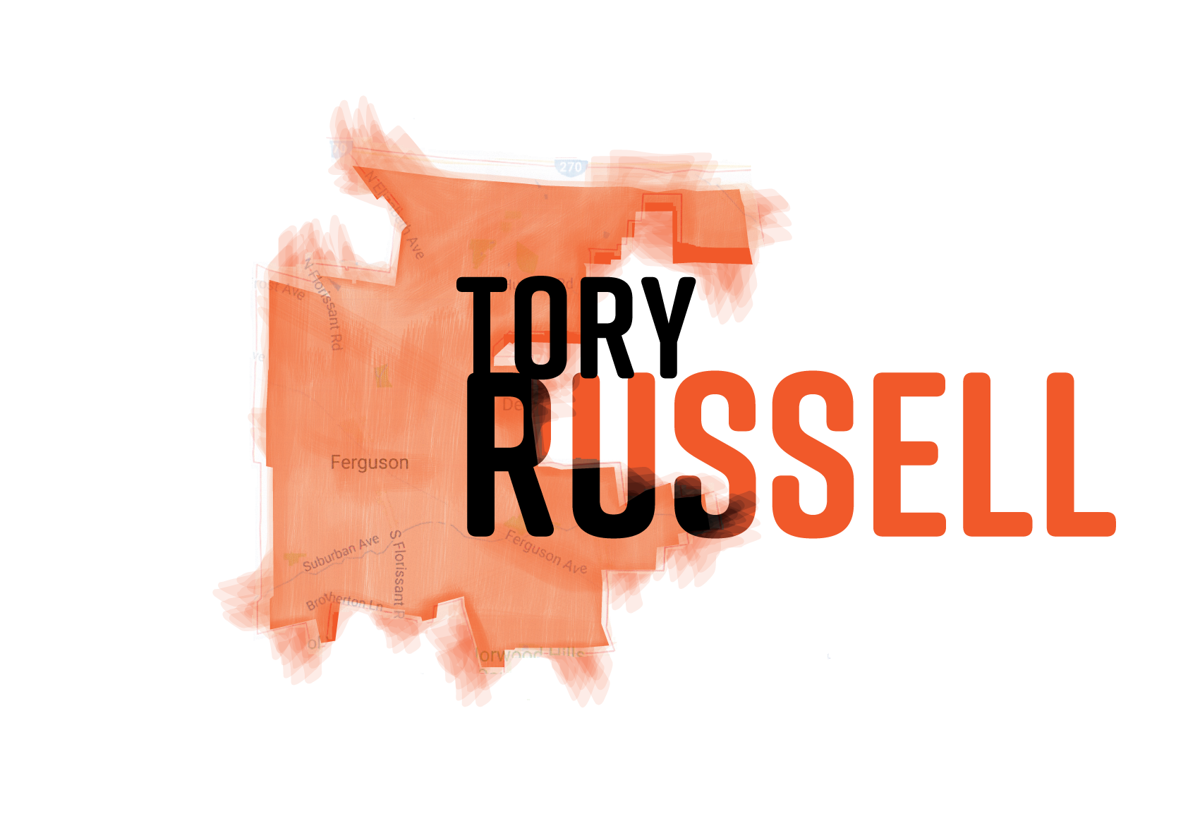
I'm trying to decide whether to add the map behind the boundary graphic for the names - I'm thinking maybe not, because I think it might detract from the names, rather than allow people to focus on the people who have contributed their stories. I'll be chatting to Leora (curator) more about this and make a decision together.
Layout of Panels
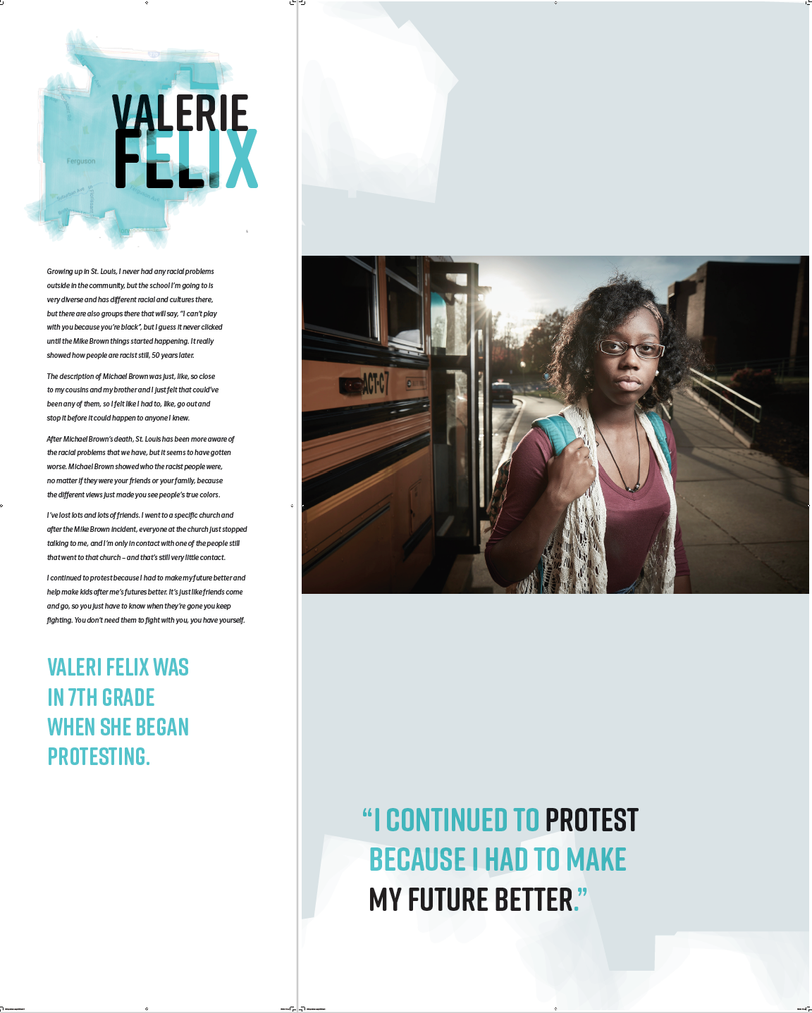
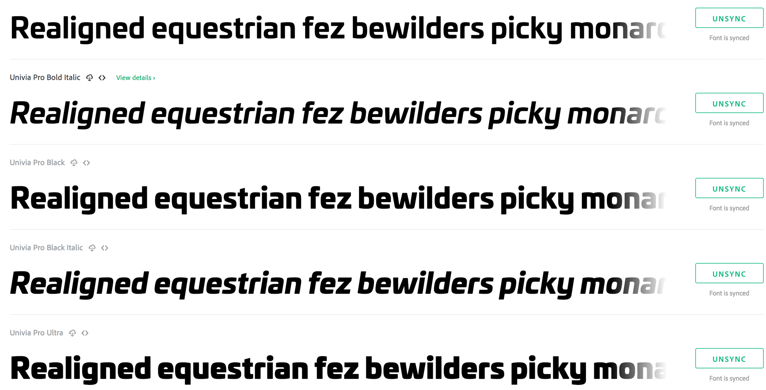
Rift Soft is an upper case only font, so it's not great for setting longer text in. I began to explore other options for the text layout (but keeping Rift Soft for headings and break out quotes, as well as other information such as the link to Soundcloud). I looked at Adobe Typekit fonts but also bit the bullet and subscribed to Monotype's fonts as well. In the end this was a good decision, because Slate pro offered a rounded feel similar to Rift Soft, but has an extensive family of weights and styles to allow for flexibility in typesetting. Below are a few options I looked into and some examples of Slate Pro within a layout:
Below are two examples of narrow and wide panels side by side (although they will not be side by side but angled slightly away from each other once installed):

