Unearthed Typography: main body text
Logo version 2: bottom graphic
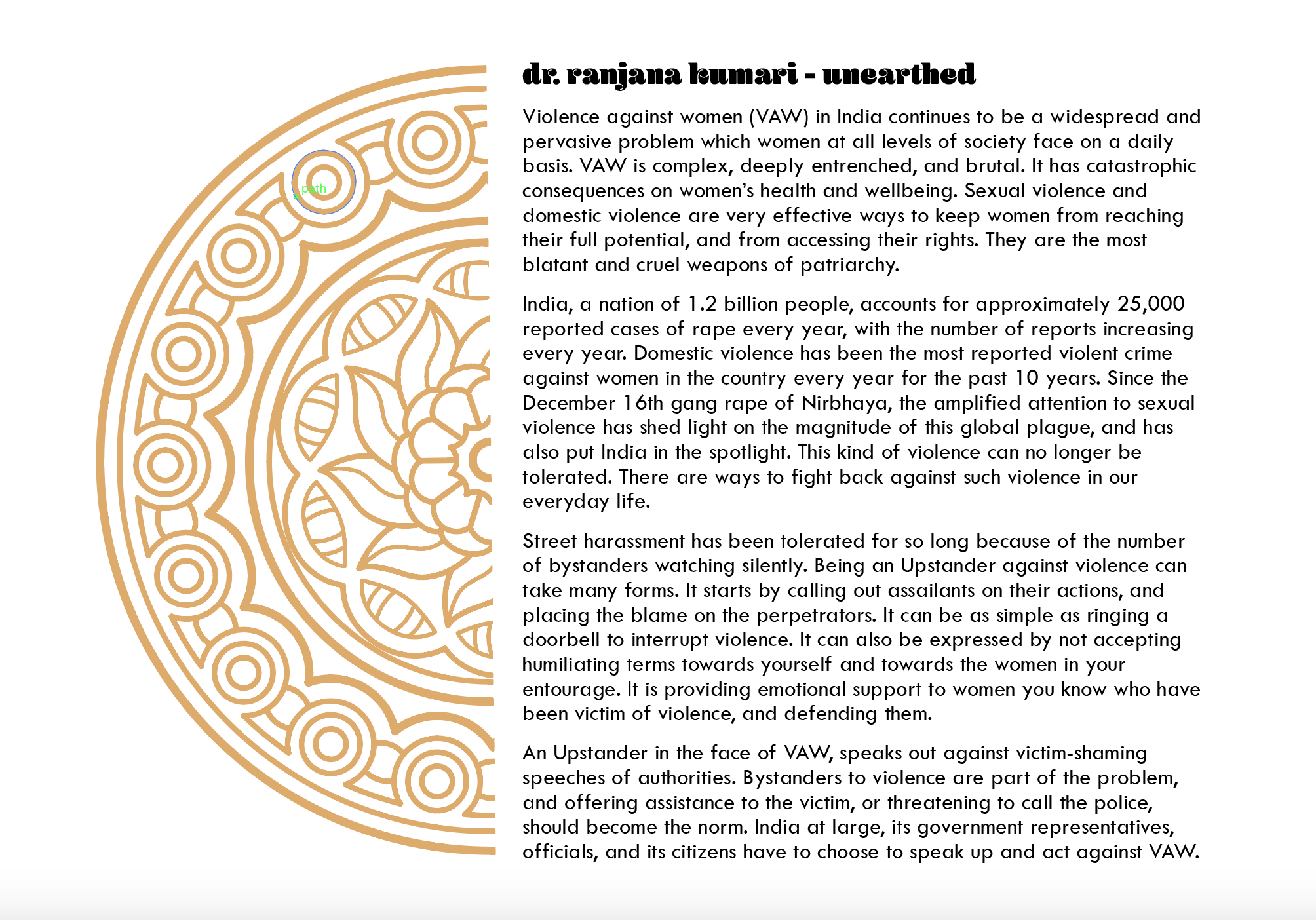
I've started looking a bit closer at the type for the main body of text in each section. I started with just some rough placeholder text a few days ago that I wasn't going to keep, but would like to leave a record of it here, because I think it's interesting to note how sans serifs can also have a lot of communicative power. In this case, the typeface was too angular.
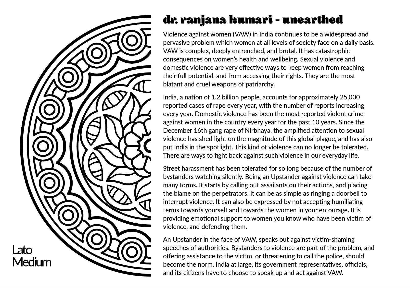
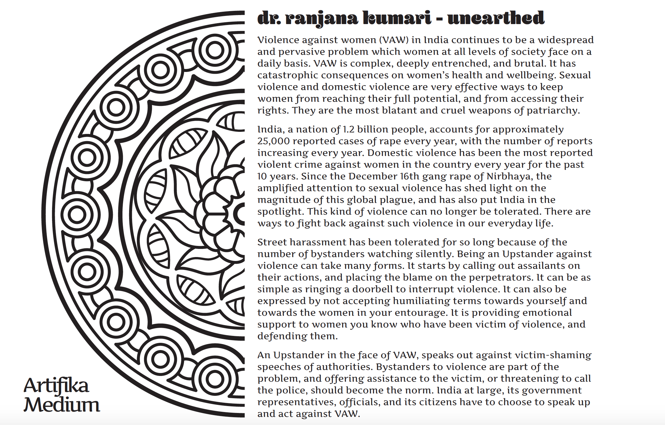
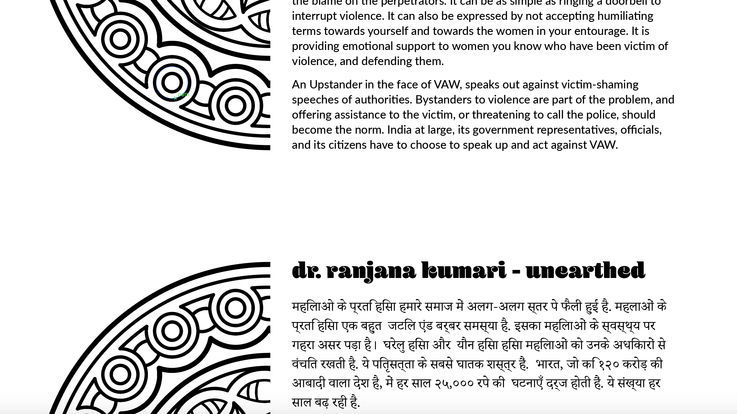
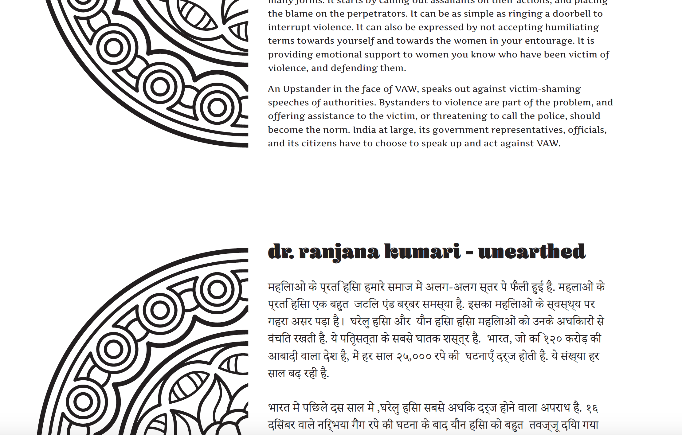
The next stage was to look at the visual interaction between the Hindi and English. Coming back to the idea of making the visual communication of the exhibition centre on the experiences of the survivors, I began to search for humanist sans serifs (because this will be cut and weeded vinyl, I'm steering clear of serifs).
The first one, Lato, has a large family of weights and postures to choose from, and from past experience this has been a very important consideration when choosing a typeface for an exhibition. However, I couldn't pass up Artifika - although it only has one weight - medium - it's a beautifully flowing, dynamic and humanist typeface. The single posture/weight does concern me though.
